Week 3 – Introduction lecture
Today we were introduced to the new topic of the week, which is Data Physicalization. First we got introduced to Data Visualization to give us a history of what Data Physicalization comes from.
The goal for data visualization is “the use of computer supported, interactive, visual representations of abstract data to amplify cognition (thought)”. It is used to amplify cognition – it makes it easier to understand information. It aims to augment the human understanding of data, but the challenge is to develop techniques that turn abstract data in to easily interpretative info. However, the use of infographics is a good way of abstracting data.
I thought of the local newspaper here in Malmö called “Sydsvenskan”, that often uses data visualization instead of just presenting abstract data as in numbers, for example to show the amount of crimes that happen in different parts of the city. For me, this way of showing data makes it easier to understand and grasp, showing a map to see where things have happened captures my interest a lot more. It is easier to perceive and interpret. Just using numbers together with the name of city parts would be harder to grasp.
The example picture to the right is not precisely the infographic I talked about in the text above.
“Meanwhile, advances in tangible computing have illustrated how humans can interact with digital information by using their natural ability to perceive and manipulate physical objects and materials.”
Instead of constraining ourselves using mediums such as computer screens and infographics on paper to represent data, Data physicalization offers the opportunity to represent data through tangible objects and materials, so that humans can explore and interact with it. Data physicalization can be either static or dynamic. Static physicalization is data that is not variable, for example, 3D printed data physicalization is static – they cannot be updated and cannot update themselves, whereas dynamic physicalization have the ability to move, be meaningful and can react to actions, thus it offers interaction possibilities as it can be manipulated and can change according to data.
Data physicalization can be used to inform or to provoke, but also together. Malileh introduced us to some examples of data physicalizations that were used for analytics, communication and art sculptures, that either only informed, provoked, or did both.
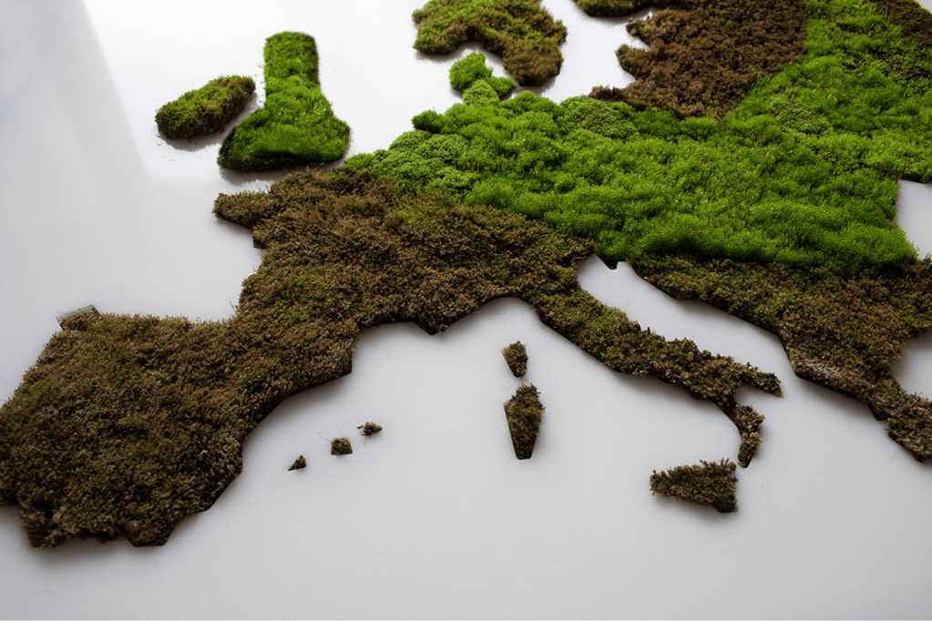
I really liked the example of using moss (which make it more alive and real) to visualize change of summertime rainfall in Europe. It communicates (informs) about where in Europe it rains, at the same time it really provoked me in the way that I started thinking of environmental issues such as greenhouse effects, which in turn could affect me in taking action to improve sustainability.

”Living Map: Precipitation Visualized with Moss.”
Designers website: https://www.behance.net/gallery/68572509/LIVING-MAP
Another example was an art sculpture about the live flight data representation. The sculpture reacted with a visual behavior each time a flight took off or landed. While discussing this with the group, most thought it was purely informative and not provocative, since it evoked the emotion of it being really beautiful. This is something I agree on, however, I felt that it could have a negative touch as it provoked me into thinking about the environmental impact planes have. The video below show how frequent the sculpture changes which represents the vast amount of planes taking off and land, which could be an eye-opener to how much we fly, at least it was so for me. I think maybe that it is quite subjective in how we see these examples as informative or provocative depending on the context and the way the receiver interprets the information.

Video: https://vimeo.com/50043124
Some other thoughts I had on data physicalization:
In a recent group project, me and my group worked on designing feedback of “flow”. To design an artefact that would express this feedback, we created a prototype that pull a user’s fingers up and down in a wave sequence. The prototype took the input of “flow” and expressed it by pulling the user’s fingers. I think that this concept could be used as a dynamic data physicalization, visualizing the data of for example traffic flow with our tangible artefact.